
Giraffe Print Chairs: A Buyer’s Guide to Bold Style


A lot of rooms reach the same point. The sofa is in place, the rug is down, the walls are handled, and the space still feels flat. It doesn't need more furniture. It needs one piece with personality.
That's where giraffe print chairs earn their keep. They're bold, but they don't have to be loud. Used well, they bring shape, texture, contrast, and a finished look that plain seating often can't deliver on its own. The hesitation is understandable. Most shoppers don't worry about whether the chair is interesting enough. They worry that it will take over the room.
That concern usually comes from shopping by photo instead of by feel, scale, and construction. A statement chair has to do two jobs at once. It has to look intentional, and it has to sit well enough to deserve its footprint.
Table of Contents
- Beyond a Trend The Timeless Appeal of Statement Chairs
- What Exactly Is a Giraffe Print Chair
- Judging Quality Before You Buy Fabric and Construction
- How to Style a Giraffe Print Chair Without Overdoing It
- Finding Your Perfect Chair at Stahl Home Center
- Your Giraffe Print Chair Buying Checklist
Beyond a Trend The Timeless Appeal of Statement Chairs
A customer walks through the showroom, spots a giraffe print chair, and has the same reaction I hear all the time. They love it for about five seconds, then worry it will overpower the room once it gets home.
That hesitation is reasonable. Bold pattern can look expensive and pulled together, or it can look like a one-off purchase that never found its place. The difference usually comes down to restraint, scale, and where the chair is asked to work.
A statement chair earns its keep by solving a room problem. It can break up a row of plain upholstery, give structure to an empty bedroom corner, or add personality to an entry that feels too bare. Giraffe print works especially well in that role because the pattern has motion, while the color family usually stays natural and easy to live with. Cream, camel, brown, black, taupe, and soft gold tend to sit comfortably with wood, leather, linen, and painted finishes.
That is why giraffe print chairs have more staying power than many shoppers expect. In the right frame and fabric, they read less like a novelty and more like a polished accent with a bit of personality.
I always tell shoppers to judge this category the same way they would judge any good accent piece. Start with the room, not the print. A chair has to fit the traffic path, support the way it will be used, and relate to the other finishes already in the space. Pattern comes after those decisions, not before.
A strong chair should be noticeable. It should also feel settled once the room comes together.
That balance is what keeps a giraffe print chair from becoming pattern overload. If the room already has busy drapery, a graphic rug, and heavily figured wood, a quieter version of the print usually works better. If the space is mostly solid upholstery and simple textures, the chair can carry more visual weight without making the room feel crowded. Homeowners who want help judging that mix can start with Stahl's advice on working with patterns in room design.
Practical use still matters. A reading chair needs comfort and support. A bedroom accent chair may prioritize footprint and shape. A chair in a family room needs fabric and construction that can handle regular use without looking tired after one season.
That is the appeal of a statement chair. It brings function first, then style that gives the room some confidence. At Stahl, that is how we help people shop this category in person. Not as a gimmick, and not as a decorating dare, but as a smart accent that can make a home feel finished.
What Exactly Is a Giraffe Print Chair

A customer usually figures this out the moment they see a few in person. “Giraffe print chair” sounds like one very specific piece, but it is really a broad upholstery category. The print can show up on a compact vanity chair, a clean-lined accent chair, a dining side chair, or a deeper lounge piece, and each one serves the room differently.
That distinction matters because the fabric tends to get all the attention first. In practice, shape, scale, and seat depth decide whether the chair reads polished, casual, dramatic, or out of place.
It's the print, plus the silhouette
Some giraffe prints are high contrast and graphic. Others are soft, tonal, and almost read like texture from across the room. That difference alone can move a chair from bold focal point to quiet accent.
The frame changes the message again. An armless chair often feels cleaner and more current. A barrel or wingback shape has more presence and usually feels more decorative. A deeper seat can be excellent for a reading corner, but it asks for more floor space and more visual breathing room around it.
One listed corner-seat version in this category measures 29" H × 29" W × 29" D, while one armless upholstered model measures 26" W × 34" D × 29" H. That gives shoppers a useful reference point. Two chairs can share the same print and still behave very differently once they are in the room.
For homeowners trying to balance this kind of pattern with the rest of the space, Stahl's guide to working with patterns in room design is a practical next step.
Why this style works beyond novelty
A giraffe print chair earns its place when the pattern supports the room instead of hijacking it. In a well-planned space, it can bring movement, warmth, and a bit of personality without forcing every other piece to compete.
That is why I encourage shoppers to stop treating it like a decorating dare. A common mistake is assuming any animal print has to be loud or theme-driven. The better versions act more like a well-suited accent. They bring contrast and character, but they still have a job to do in the room.
Practical rule: Evaluate it in two passes. First, decide whether the print is refined enough for the space. Then decide whether the chair itself is the right size, shape, and comfort level for how it will be used.
Buyer intent also changes what “giraffe print chair” means. Some shoppers want a neutral chair with more life than a solid fabric. Others want a true statement piece for a bedroom corner, office, or sitting area. At Stahl, that is usually where the conversation gets easier in person. Once the goal is clear, the right version of this category is much easier to spot.
Judging Quality Before You Buy Fabric and Construction
The print is the finish, not the structure
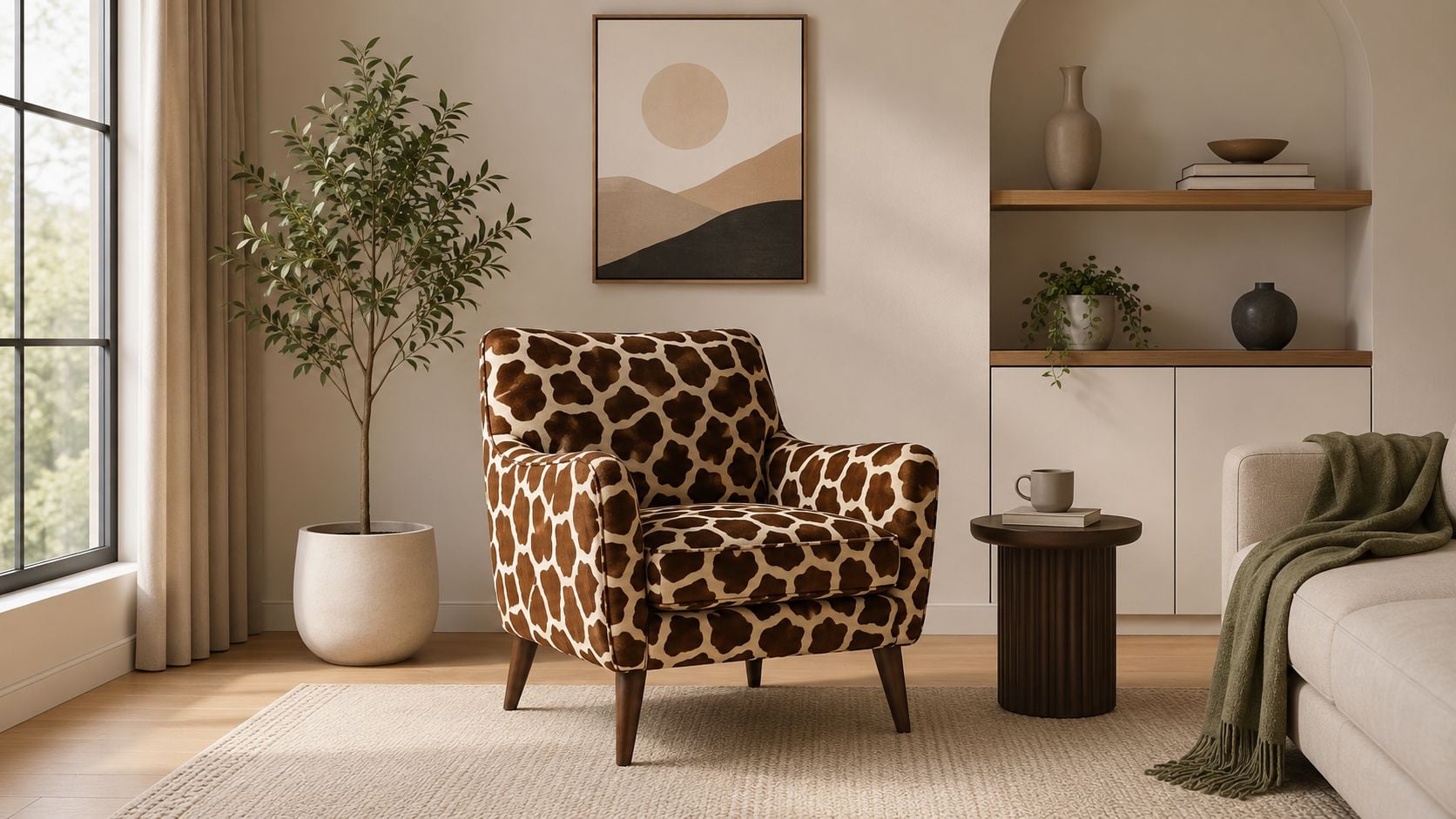
The long-term performance of a patterned chair is driven by its build, not the print itself. Construction details from retail listings in this category point buyers toward markers that matter: tightly stitched seams, resilient cushions, upholstery quality, and finishing details such as welt cord trim, as described in this product listing focused on construction and upholstery details.
That's the first trade-off to understand. A dramatic fabric can hide mediocre construction for a while. It can't stop loose seams, flattened cushions, or fabric abrasion from showing up later. In busy homes, rental settings, or any room where the chair will be used instead of admired, surface appeal should rank below build quality.
For readers comparing upholstery options more broadly, this upholstery materials guide is a smart companion.
A simple good-better-best way to assess quality
A practical way to shop giraffe print chairs is to think in good, better, best terms.
| Level | What to look for | Where it fits |
|---|---|---|
| Good | Clean pattern application, stable feel, decent seam alignment | Lower-use spaces such as guest rooms or occasional seating |
| Better | Stronger stitching, more supportive cushion feel, neater tailoring | Everyday accent use in living rooms or bedrooms |
| Best | Performance-minded upholstery, resilient cushions, refined finish details like welt cord trim | High-traffic homes where the chair needs style and stamina |
A quick in-person inspection tells a lot.
- Check the seams: They should look tight and even, especially where arms, seat deck, and back meet.
- Press the cushion: It should recover shape instead of staying compressed.
- Look at the tailoring: Pattern placement doesn't need to be perfectly matched everywhere, but it should look intentional.
- Inspect the edges: Welting, piping, and corners often reveal the care put into the chair.
Decorative fabric draws the shopper in. Tailoring, support, and cushion resilience are what justify bringing the chair home.
A few common red flags tend to show up repeatedly. Fabric that puckers at the seams, a seat that already feels tired on the floor, visible looseness at corners, and an overall lightweight feel usually signal a chair chosen for appearance first. That may work for a staged room. It rarely satisfies in daily living.
The strongest chairs in this category balance three things at once. They feel comfortable at rest, they look controlled rather than overdesigned, and they use upholstery that suits the household. For style-focused buyers, performance fabrics are often the most sensible route. For quality seekers, engineered comfort and durable tailoring matter more than novelty. That's where trusted upholstery lines and well-built accent seating separate themselves from one-season purchases.
How to Style a Giraffe Print Chair Without Overdoing It
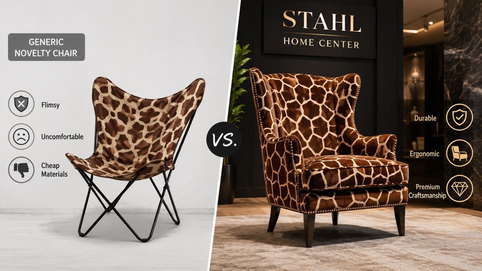
The biggest question shoppers have isn't whether giraffe chairs are stylish. It's how to pair them with other patterns. A restrained giraffe print can function as a neutral accent and anchor a room's palette rather than overwhelm it, a point reflected in this discussion focused on pairing patterns with giraffe chairs.
Start with what the chair is doing in the room
If the chair is the only patterned seat in the space, it can carry more visual weight. If the room already has a patterned rug, drapery, or wallpaper, the chair needs a supporting role instead.
That's why giraffe print works best when it's assigned a clear job.
- Anchor a neutral room: In rooms with solid upholstery and simple walls, the chair can introduce movement without changing the whole palette.
- Break up matching furniture: Two identical sofas or a sofa-and-loveseat setup often benefit from one patterned accent.
- Warm up hard finishes: Rooms with wood, metal, glass, or stone usually need a softer organic pattern to keep them from feeling stiff.
Readers looking for more accent-chair placement ideas can explore five ways to use an accent chair.
What works and what usually misses
The easiest way to keep giraffe print refined is to support it with calm surroundings. Solid upholstery is usually the safest partner. Natural wood tones, black accents, woven textures, and creamy rugs also help because they echo the pattern without repeating it too exactly.
A simple styling formula often works well:
- Choose one dominant pattern. Let the chair be that pattern.
- Repeat one or two colors from it. Pull a brown, cream, taupe, or black note into pillows, lampshades, frames, or a throw.
- Add texture before adding more print. Linen, boucle, leather, jute, and wood do more for balance than another busy motif.
- If a second pattern is necessary, shrink the scale. A small stripe or subtle geometric usually behaves better than another large organic print.
What tends to fail is stacking bold-on-bold without any pause. A giraffe print chair next to a loud floral rug and graphic drapery can work in a tightly directed interior, but most everyday rooms don't have enough restraint elsewhere to support that combination.
Keep one thing lively, one thing quiet, and one thing tactile. That mix usually feels designed instead of accidental.
Another common mistake is forcing the chair into a room that wants a different shape. Sometimes the pattern is right but the silhouette is wrong. A heavy wingback can overwhelm a light apartment. A small slipper chair can disappear in a larger family room. Styling starts with scale, not accessories.
When giraffe print chairs are used well, they don't read as theme furniture. They read as edited, layered, and confident.
Finding Your Perfect Chair at Stahl Home Center
A lot of shoppers arrive with the same concern. They like the idea of a giraffe print chair, but they do not want to buy something that feels louder in person than it did on a screen.
That concern is valid. Pattern, scale, sheen, and chair shape are much easier to judge in a showroom than on a phone. A photo can make a fabric look soft when it is slick, or make a comfortable seat look refined when it sits too upright for real daily use. With a statement chair, those details decide whether the piece feels collected or gimmicky.
Seeing options in person also helps with a trade-off many people miss at first. Sometimes the right print is on the wrong silhouette. Sometimes the comfort is right, but the pattern scale is too busy for the room. Being able to compare several chairs side by side shortens that decision and usually leads to a better buy.
At Stahl Home Center, shoppers in Bloomington can test comfort, study fabric up close, and compare accent seating with the rest of the living room furniture they need in one trip. That matters if the chair has to work with an existing sofa, a reading corner, or a larger room update instead of standing alone as a one-off piece.
Speed is another practical advantage. If the room needs a finishing piece now, in-stock options can solve the problem quickly and let you see exactly what you are buying before it goes home. That route makes sense for guest rooms, recent moves, or anyone trying to close a seating gap without waiting through a custom timeline.
Custom order is worth considering when the room already has a clear direction and the chair needs to hit a specific note in color, texture, or function. Stahl also offers custom-order partners with broad upholstery choices and comfort-focused seating, so shoppers can get closer to the exact look they want instead of settling for a near match. If that route is new to you, this guide to getting started with a custom furniture order lays out the process clearly.
I usually give customers a simple rule. Buy in stock when the chair needs to solve a room quickly. Go custom when the chair needs to finish a room precisely.
Stahl handles both paths well. The showroom is large enough to make honest comparisons easy, and the staff can help you sort through scale, comfort, fabric, and timing without turning the process into a sales pitch. That kind of hands-on help is a big reason bold accent chairs feel less risky when you shop locally.
Your Giraffe Print Chair Buying Checklist
Use this checklist before making the final decision.
- Measure the actual footprint: Confirm the chair fits the wall, rug, and walk path, not just the empty corner.
- Match comfort to use: Reading chair, vanity chair, occasional seat, and lounge accent all need different support.
- Inspect the build: Look closely at seams, cushion recovery, and tailoring quality before focusing on the pattern.
- Choose the right upholstery: Performance-minded fabric is usually the safer pick for active households.
- Treat the pattern like a neutral: Repeat one or two tones from the chair elsewhere in the room.
- Limit competing prints: One dominant pattern usually looks stronger than several fighting for attention.
- Sit before buying when possible: A statement chair still has to earn its place through comfort and feel.
- Review broader chair shopping cues: These things to look for in a new sofa or chair are worth keeping in mind.
Ready to find a bold accent that still feels right at home? Visit Stahl Home Center and explore the 88,000+ sq. ft. showroom on Bloomington's west side. From In-Stock Today accent seating and living room furniture Bloomington shoppers can take home right away, to custom options from La-Z-Boy and Rowe Furniture, the store makes it easy to compare comfort, quality, color, and scale in person. Visit our Westside Bloomington showroom today to see our massive selection in person.