

Home Decor Green: A Practical Guide to Using Green Right


You know the moment. A sage swatch is in one hand, a lamp is on, and the wall suddenly looks greener, grayer, or bluer than it did at the store. That's usually when a homeowner realizes green isn't one color, it's a family of colors that changes with light, texture, and the things already in the room.
That's also why home decor green works best when it's treated as more than a paint-chip choice. Green can calm a busy room, add depth to a neutral palette, and connect a home to the outdoors, but it can also look muddy, icy, or overly trendy if the room, finish, and fabric don't support it. A good first move is simple, check how the room looks in morning light, afternoon light, and with the lamp on at night, then ask whether the green still feels comfortable in all three settings. If it doesn't, the color probably needs a different undertone, a warmer companion material, or a different room entirely.

Why Green Works in a Home and Where It Often Fails
Green earns its place in a home because it does three quiet jobs at once. It softens a room that feels too sharp, it gives neutral walls and floors something to lean against, and it brings a little bit of the outdoors in without making a space feel themed. That's why it keeps showing up in decorating conversations, from subtle sage to deep forest, even when homeowners say they're not sure where to start.
The problem is that green is rarely judged in the same light it was chosen in. A shade that looks relaxed in a showroom can read flat under warm bulbs, or cold in a room with north-facing light and cool white trim. In real homes, the wall color, sofa fabric, floor tone, and window exposure all keep changing the result.
The three jobs green has to do
Green works best when it has a clear assignment. In one room, it may need to calm the visual noise from a lot of furniture. In another, it may need to contrast a beige or ivory palette without stealing attention. In a third, it may need to echo a view of trees or a garden so the room feels connected to the outdoors.
Practical rule: if the room already feels busy, choose a green that blends. If the room feels flat, choose a green that adds contrast. If the room feels disconnected from the outdoors, choose a green that carries that natural note inside.
The easiest litmus test is to look at the room and ask whether green has room to breathe. If the space already has strong patterns, several wood tones, and limited daylight, a very saturated green can fight the rest of the room. If the space is quiet, bright, or mostly neutral, green usually has an easier path.
For a color-only check before buying furniture, the guide on how to avoid color mismatch when ordering online helps frame the problem the right way. Green is rarely wrong by itself, but it can be wrong for a room's light and materials.
The Color Theory Behind Green You Actually Need
Green looks simple on a screen and complicated in a real house because it sits between warm and cool families. That middle position is why one green can look cozy beside oak flooring, while another can feel sharp next to the same floor. A useful way to think about it is a shade wheel split in half, one side warm, one side cool, with green standing near the line and borrowing from whichever side is closest.
Read the undertone first
Gray-greens usually feel quieter and more lived-in. Blue-greens read cooler and cleaner, which can help in bright rooms or spaces with crisp white trim. Yellow-greens feel warmer and more energetic, but they can become louder faster, especially when the room already has strong daylight.
Lighting changes the answer again. A green that looks balanced at 10 a.m. can look deeper and more muted at 10 p.m. once the lamp is on. That's normal, not a flaw in the color. The mistake is choosing from one moment only.
Match the green to the room's temperature
Warm wood floors, cream trim, brass details, and beige upholstery usually welcome greens with earthy or grayed undertones. Cooler spaces with pale walls, chrome, or blue-based neutrals often take cleaner blue-greens more easily. When the undertone and the room's base materials speak the same language, the whole space feels more settled.
A helpful habit is to place the swatch next to the largest fixed pieces in the room, not in empty air. A green that looks elegant by itself can look off beside a sofa arm, a cabinet front, or a floor sample. That's why a furniture showroom matters, the color has to work with the material, not just on paper.
Choosing the Right Green for Each Room
The safest way to choose green is to stop thinking in broad terms and start matching shade to use. A soft sage in a bedroom does a different job than a dark forest green in a dining room, and a misty blue-green in a hallway solves a different problem than olive in a family room. The room's light, size, and function should lead the decision.
A quick room-by-room table
| Room | Best Green Family | Lighting That Helps | Watch Out If |
|---|---|---|---|
| Bedroom | Sage, mint, misty blue-green | Soft daylight, lamps with warm bulbs | The room already feels cool or shadowed |
| Living room | Olive, eucalyptus | Mixed daylight and evening lamp light | The space has many wood tones that compete |
| Dining room | Forest, emerald | Controlled light, pendant or chandelier glow | The room is very small and already dark |
| Bathroom | Mint, misty blue-green | Bright reflective light | The finish is too glossy and feels cold |
| Hallway | Sage, pale blue-green | Natural light from nearby rooms | The hall is narrow and nearly windowless |
| Home office | Forest, deeper olive | Task lighting plus some daylight | The room needs to stay visually calm |
What tends to work, and what tends to miss
Sage and mint are usually the easiest greens for rooms that need softness. They can make a bright bedroom or a quiet sitting room feel lighter without turning attention away from the furniture. Olive and eucalyptus usually suit gathering spaces better, because they carry a little more warmth and weight.
Forest and emerald do well where depth matters more than airiness. They can make a dining room feel grounded or give an office a more focused feel, but they need enough light to keep from looking heavy. Misty blue-greens are useful in small bathrooms and narrow halls because they add color without crowding the walls.
For homeowners comparing wall colors with furnishings, the guide to picking the perfect paint color for your home is a smart companion. Green almost always behaves better when the wall color and upholstery are chosen as a pair, not as separate decisions.
Pairing Green With Neutrals and Accent Colors
Green gets easier once the room has a simple structure. A strong neutral, a chosen green, and one accent that ties the two together usually beat a room full of loosely related colors. That formula keeps green from looking random, which is the mistake that makes so many pretty rooms feel unfinished.
Use one dominant neutral, then layer
Warm whites are a natural partner for sage because they keep the room from feeling stark. Cream works well with olive because the pairing feels soft and grounded. Charcoal gives emerald more drama and helps it read intentional instead of decorative.
Warm wood belongs in almost every green room because it repeats the natural note without competing with it. The trick is not to match every grain and undertone exactly. Instead, let the wood act as a bridge between the floor, the upholstery, and the smaller accents.
A green chair, a green lamp base, or a single green pillow can do more than a whole room of weak matches. One strong piece gives the eye a place to land.
Keep the accent small, but specific
A green velvet chair can carry a corner without forcing the rest of the room to become green. A botanical-print pillow can pull in the color through pattern, which helps when the room needs softness. Green glassware or a small decorative bowl can repeat the color on a table or shelf and make the whole room feel connected.
Over-matching is where people get into trouble. If the wall, the sofa, the pillows, and the art all chase the same green, the room can feel flat instead of layered. It usually looks better when the green appears in a few related places, each with a slightly different texture.
For more ways to balance scale and repetition, the ideas in throw pillow combinations are useful. The same principle applies here, a little variety makes the green feel designed, not staged.
Fabrics and Materials That Make Green Look Better
Two sofas can share the same green and still read in very different ways. Fabric changes how light sits on the surface, how deep the color feels, and how forgiving the piece is in daily use. That is why material choice matters as much as shade choice when the goal is a green room that still looks good at night, not just under store lighting.
Green behaves like a quiet chameleon on fabric. A matte weave can soften it, while a plush surface can make it feel deeper and more layered, especially once the lamp is on and daylight is gone.
Compare the common fabric options
| Fabric | Look and Feel | Best Rooms | Care Note |
|---|---|---|---|
| Cotton | Casual and breathable | Guest rooms, light-use seating | Can show wear faster in busy spaces |
| Linen | Relaxed, textured, airy | Bright living rooms, quiet bedrooms | Wrinkles easily and needs a gentler hand |
| Velvet | Deep, rich, luminous | Accent chairs, formal spaces | Shows nap direction and needs careful cleaning |
| Boucle | Soft, tactile, cozy | Reading corners, low-traffic rooms | Texture can trap dust and crumbs |
| Leather | Smooth, structured, durable | Family rooms, offices | Needs regular care to stay supple |
| Performance weave | Practical and resilient | Everyday sofas, kid and pet homes | Built for harder use and easier cleaning |
For households that use a sofa every day, a performance fabric is often the practical choice, especially when the green is part of a long-term room plan. Stahl Home Center's custom upholstery options can help match the shade to the way the room gets used, which matters in homes with kids, pets, or constant traffic.
A green that looks soft in a showroom can feel louder in a bare room, or calmer once it sits beside wood, lamps, and other furniture. That is why the fabric sample matters as much as the swatch. A homeowner needs to see the color in person, feel the texture, and sit on the piece before deciding whether the room can live with it.
Why the showroom test matters
The same green can shift under different light sources. Under bright showroom lighting, it may look cleaner or brighter. In a living room with warmer bulbs, it can settle into a deeper tone and show more of its undertone. That difference is normal, and it is also why the sit-test matters.
Texture changes the read too. Velvet can make green feel richer, while linen or cotton can pull it toward a more relaxed, natural look. If a room needs softness around a hard floor or a strong wall color, the right material can do some of that work for you.
For a deeper material walk-through, everything you need to know about upholstery materials gives a useful frame for comparing comfort and care. Homeowners thinking about window treatments can also look at Roman shades green ideas for a useful sense of how fabric and color work together in a room.
Room-by-Room Green Ideas That Actually Work
Green solves different problems depending on the room. In one space, it can soften a hard corner. In another, it can make a long passage feel less like a tunnel. The best ideas are usually the ones that fit the room's shape and light instead of trying to force a style trend into it.
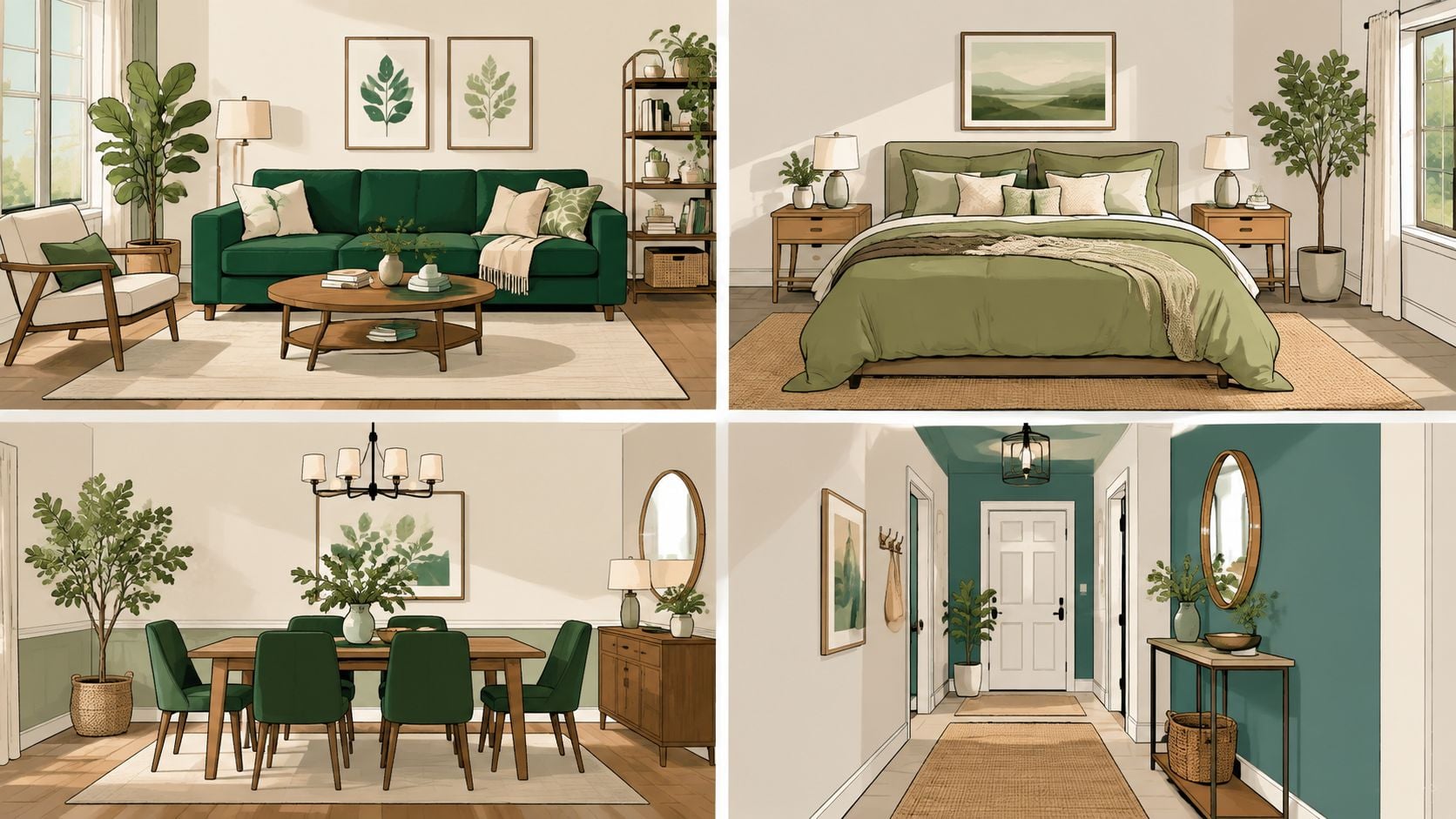
Living room and bedroom
In a living room, a safe move is a green accent chair or a pair of pillows in a muted shade. A bolder move is a green sofa in a performance fabric that can handle real use. A quick styling tip, repeat the same green in a lamp, tray, or throw so the room doesn't feel like it has one lonely accent.
In a bedroom, sage bedding or a green upholstered bench usually feels calm without taking over. A bolder move is a deeper green headboard or a forest-toned accent wall behind the bed. One small lamp with a green base can make the room feel finished without adding clutter.
Dining room, hallway, bathroom, and office
A dining room can handle more depth than many people expect. Green chairs, a painted buffet, or even a dark green sideboard can give a builder-grade room some character. In a hallway, a softer green on the walls can shorten a long run visually and make the passage feel less abrupt.
Bathrooms often benefit from green in the small things, a towel, stool, shelf, or framed print, because too much color can feel crowded. In a home office, deeper greens usually work better than bright ones because they help the room feel focused. That's also one of the places where decorate with houseplants can be a useful complement, since the room can borrow softness from living greenery without adding more hard surfaces.
Useful shortcut: if a room feels awkward, use green to solve the room's shape first, then decide whether the color should appear in furniture, fabric, or a wall finish.
For more visual ideas across tricky spaces, green interior design inspiration is a helpful starting point.
Caring for Green Upholstery, Walls, and Accents
Green stays handsome longer when the care routine is simple and steady. Upholstery benefits from regular vacuuming and cushion rotation, because even a forgiving fabric looks tired when one seat gets all the use. Velvet and boucle need gentler spot-cleaning, while performance fabrics still need protection from direct sun so the color doesn't fade unevenly.
Painted green walls need the same kind of practical attention. Touch-ups work best when the original paint is saved, the sheen matches, and the patch is blended across a wider area instead of dabbed into one small square. That matters more in green than in some other colors, because slight shifts in finish can make repairs stand out.
Low-VOC paints and finishes are a smart move in rooms where people spend a lot of time, especially bedrooms and nurseries. Industry guidance treats low-VOC and non-toxic finishes as a measurable difference in interior products, and indoor air quality becomes a bigger concern as rooms get tighter and more furnished. EPA guidance also points to formaldehyde and TVOC emissions as important technical markers for indoor-air-sensitive furnishings, and public procurement specifications in Hong Kong set explicit formaldehyde limits for some panel materials. Those controls matter because green rooms often rely on wood-based furniture, panel surfaces, and painted finishes all at once. See the EPA's furniture emissions reference through ANSI/BIFMA X7.1 guidance and the broader furniture criteria in the EU Green Public Procurement furniture document for the kinds of measurable limits that make low-emission pieces easier to compare.
Durability matters for the same reason. Sustainable interior guidance keeps coming back to items that are good quality and durable, because pieces that last longer don't need to be replaced as often. Reclaimed, recycled, and secondhand materials also fit that logic well, since they keep usable goods out of the waste stream.
For a homeowner who wants green decor without waiting months, Stahl Home Center is one place that keeps thousands of pieces in stock and supports custom ordering when a specific fabric or configuration is needed. The practical advantage is simple, it lets a room start changing now instead of sitting half-finished.
Bringing Your Green Plan Together
A good green decision comes down to three plain questions. What job does the color need to do in this room, which shade fits the light, and which fabric or finish can handle real life. If the answer feels uncertain, the swatch needs more time in the room, not more guessing.
Large samples on the wall at different times of day usually tell the truth faster than a tiny chip ever will. That's why the strongest green rooms tend to be the ones where the color, the material, and the furniture were tested together before anything was purchased.

For homeowners ready to build a green room in person, Stahl Home Center offers a large showroom with in-stock sofas, recliners, accent pieces, and custom options that can be seen, touched, and compared under real light. Visit the Westside Bloomington showroom to check greens against wood, fabric, and finish, then choose the piece that fits the room instead of the screen.


